Modern Website Design Principles for Senoia Brands Targeting Higher Retention
Clean interface design isn’t simply about aesthetic preference — it is conversion psychology. A visitor forms trust, impressions, and buying readiness within seconds. The structure of your layout communicates authority before a single word is read.
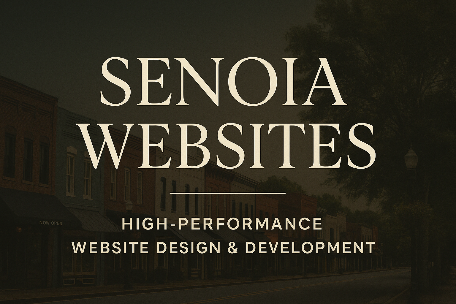
Senoia businesses competing in professional service sectors, hospitality, home services, financial services, and healthcare quickly discover that design clarity directly impacts lead volume and customer confidence.
Trust Is a Design Outcome — Not a Belief
Users make unconscious decisions based on:
- spacing
- typography
- symmetry
- color theory
- layout rhythm
- visual hierarchy
When the interface looks modern, intentional, and well-structured, the brand feels more competent, more reliable, and more capable.
Trust drives conversions. Conversions produce revenue. Design is the bridge between both.
Key Principles Used in High-Conversion UI Systems
✔️ Hierarchical Spacing That Guides the Eye
Whitespace isn’t empty space — it’s directional flow. Users should instantly know:
- where to look
- what matters most
- what action to take next
Proper spacing eliminates visual noise and helps visitors navigate effortlessly. In a competitive local market like Senoia, well-structured spacing reinforces that your website design is deliberate, not accidental.
✔️ Color Decisions That Shape Authority
Professional interfaces avoid guesswork. High-performing Senoia websites use:
- neutral bases for clarity and legibility
- accent tones reserved for interaction and CTAs
- contrast that prioritizes readability across devices
- psychologically aligned brand palettes that match the offer
Colors either reinforce trust or weaken it. Strategic design uses tone to convey expertise, stability, and polished branding.
✔️ Typography That Communicates Clarity and Expertise
Font choice dictates how your message is perceived:
- scalable sizing that adapts across viewports
- balanced weights for headlines, subheads, and body copy
- refined line spacing for comfortable reading
- disciplined structure and consistent hierarchy
Strong typography reads effortlessly, feels premium, and elevates the entire message. It’s one of the fastest ways to visually signal that your brand takes quality seriously.
✔️ Layout Systems That Encourage Interaction and Credibility
Design isn’t decoration — it’s engineered logic. Modern layouts:
- remove friction from key paths like “Contact” or “Book Now”
- elevate conversion elements instead of burying them
- maintain consistent grid alignment across sections
- allow the brand to feel organized, trustworthy, and competent
When users don’t struggle to interpret what they see, they’re far more likely to act — whether that’s submitting a form, scheduling a consultation, or calling your office.
Why Clean UI Directly Impacts Revenue
Every element influences user behavior:
- confidence
- clarity
- perception of quality
- likelihood of conversion
Studies consistently show that clean visual architecture increases retention time, engagement depth, and form-submission rates. It also reduces bounce by eliminating confusion and decision fatigue.
Good design is silent proof of operational excellence. If your interface looks intentional, users assume the business operates with discipline and capability.
Senoia Brands Competing Locally Need Modern Design Standards
The fastest-growing businesses in Senoia are not just marketing harder — they are presenting themselves with visual integrity that instantly differentiates them. When two companies offer similar products, people choose the one that feels more capable.
Your interface communicates that before any copy, reviews, or sales calls do.
Clean design builds trust. Trust increases conversions. Conversions drive revenue.
And that is why modern UI isn’t an expense — it’s a multiplier for your online presence and a competitive advantage for any brand investing in serious website development near Senoia.